
Monograms: initials, a face, a thread
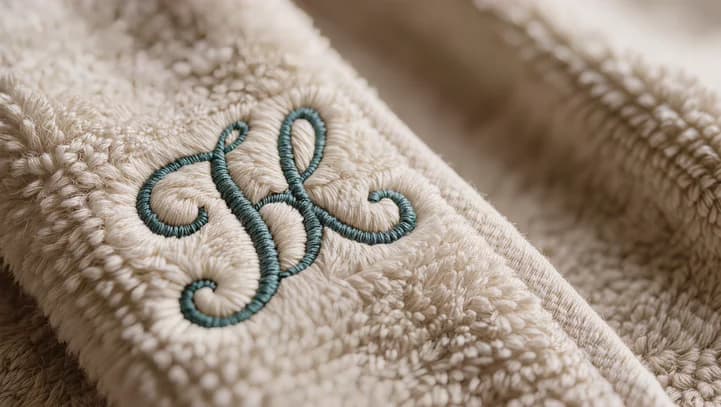
A monogram is the oldest thing embroidery does and the hardest to get slightly wrong, because everyone knows what one is supposed to look like.
The order of the letters
For a traditional three-letter monogram, the surname initial goes in the middle and is set larger than the other two: first name on the left, surname in the centre, middle name on the right. So Amélie Rose Dubois is A D R, not A R D. A two-letter monogram is simply first then last, both the same size.
Couples sometimes use a shared surname in the centre with both first initials either side. There is no rule you have to follow — but if you set three letters the same size in name order, it reads as initials rather than as a monogram, and that is usually not what people wanted.
Which faces work
Monogram faces are drawn to interlock: the letters are designed to overlap and share strokes. A script face does this beautifully and needs size to do it — below about 25mm the crossings start to fill in and the letters lose their gaps. A serif or block monogram holds together much smaller, down to 15mm or so, and suits a shirt cuff or a cap side panel where a script would be a smudge.
Size and thread
Two rules that save most of the disappointment:
- Contrast beats colour. A tonal monogram — cream on white, navy on black — is elegant in daylight and invisible in a photograph. If it needs to be seen, put some distance between the thread and the cloth.
- One colour. A monogram is a mark, not a picture. Two threads halve its authority.
Where it goes
Traditionally: the cuff, the chest over the heart, the corner of a towel, the turned-up brim of a beanie. All four are places the fabric is doubled or stable, which is not a coincidence — the convention grew out of what could actually be stitched well.